This article was last updated on November 5, 2024 to include performance optimization tips and responsive design techniques for improved chart rendering in Recharts.
Introduction
Charts make it easy to represent complex data in a simple and visually appealing way. With charts, you can easily identify trends and patterns and make comparisons across different variables and data types. You can use charts to interpret current data and predict the future.
There are several types of charts you can use to visually represent data. Some of them include Line Charts, Bar Charts, Area Charts, and Scatter charts. The choice of a chart largely depends on the type of data. Different types of charts are suited for different purposes.
There are several libraries for creating charts in the React ecosystem. These React chart libraries include react-flow-charts, react-financial-charts, react-charts and Recharts. In this article, we will explore how to create charts in a Refine project using Recharts.
What we will cover:
- What is Recharts
- How to create a Refine project
- How to install Recharts
- Create a Line chart using Recharts
- Create Area chart using Recharts
- Create a Bar chart using Recharts
- Create Scatter chart using Recharts
- Create a Pie chart using Recharts
- Create TreeMap using Recharts
- Recharts Performance Optimization with Large Data Sets
- How to Make Recharts Responsive for Different Screen Sizes
What is Recharts
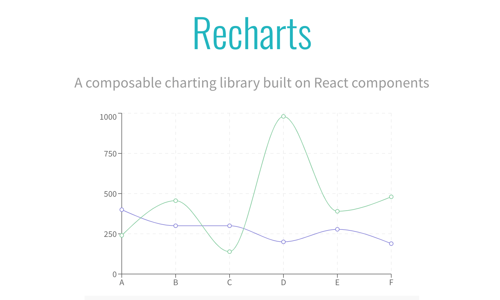
Recharts is a popular, MIT-licensed library for creating charts in React and React-based frameworks like refine. Internally, it uses SVG and some lightweight D3 packages as its dependencies.
Recharts has several built-in components that you can compose to create some of the commonest charts such as Area charts, Bar charts, Pie charts, and Line charts.
As an example, the code below illustrates how you can use Rechart's built-in components to create a Bar chart. The component names are self-explanatory.
import {
  BarChart,
  CartesianGrid,
  XAxis,
  YAxis,
  Tooltip,
  Legend,
  Bar,
} from "recharts";

<BarChart width={730} height={250} data={data}>
  <CartesianGrid strokeDasharray="3 3" />
  <XAxis dataKey="name" />
  <YAxis />
  <Tooltip />
  <Legend />
  <Bar dataKey="pv" fill="#8884d8" />
  <Bar dataKey="uv" fill="#82ca9d" />
</BarChart>;
How to create a Refine project
In this section, we will create a Refine demo project.
npm create refine-app@latest
Select the options below when prompted by the command line tool.
✔ Choose a project template · Vite
✔ What would you like to name your project?: · refine-recharts-demo
✔ Choose your backend service to connect: · REST API
✔ Do you want to use a UI Framework?: · Material UI
✔ Do you want to add example pages?: · Yes
✔ Do you need any Authentication logic?: · No
✔ Choose a package manager: · npm
After setting up the project and installing dependencies, use the command below to launch the development server.
npm run dev
Later in this article, we will create charts using Recharts and render them in a dashboard. Let's add a dashboard to the project we have just created.
Create the src/pages/dashboard/list.tsx file. Copy and paste the code below into it. Be aware that the dashboard directory doesn't exist yet. You need to first create it.
import React from "react";

export const DashboardPage: React.FC = () => {
  return <p>Hello world!</p>;
};
The component above renders a simple "Hello world!" text at the moment. We will add more code to it later. Now we need to export the component above. Create the src/pages/dashboard/index.ts file. Copy and paste the code below into it.
export { DashboardPage } from "./list";
You can now import the DashboardPage component we created above and render it in the <App /> component. Add the changes below to the src/App.tsx file.
Show App.tsx code
...
import { DashboardPage } from "./pages/dashboard";

function App() {
  return (
    <BrowserRouter>
      <RefineKbarProvider>
        <ColorModeContextProvider>
          <CssBaseline />
          <GlobalStyles styles={{ html: { WebkitFontSmoothing: "auto" } }} />
          <RefineSnackbarProvider>
            <DevtoolsProvider>
              <Refine
                dataProvider={{
                  default: dataProvider("https://api.fake-rest.refine.dev"),
                  metrics: dataProvider("https://api.finefoods.refine.dev"),
                }}
                notificationProvider={notificationProvider}
                routerProvider={routerBindings}
                resources={[
                  {
                    name: "blog_posts",
                    list: "/blog-posts",
                    create: "/blog-posts/create",
                    edit: "/blog-posts/edit/:id",
                    show: "/blog-posts/show/:id",
                    meta: {
                      canDelete: true,
                    },
                  },
                  {
                    name: "categories",
                    list: "/categories",
                    create: "/categories/create",
                    edit: "/categories/edit/:id",
                    show: "/categories/show/:id",
                    meta: {
                      canDelete: true,
                    },
                  },
                  {
                    name: "dashboard",
                    list: "/dashboard",
                    meta: {
                      label: "Dashboard",
                      dataProviderName: "metrics",
                    },
                  },
                ]}
                options={{
                  syncWithLocation: true,
                  warnWhenUnsavedChanges: true,
                  useNewQueryKeys: true,
                  projectId: "5l4F52-JwXWMu-eZRGwA",
                }}
              >
                <Routes>
                  <Route
                    element={
                      <ThemedLayoutV2 Header={() => <Header sticky />}>
                        <Outlet />
                      </ThemedLayoutV2>
                    }
                  >
                    <Route
                      index
                      element={<NavigateToResource resource="blog_posts" />}
                    />
                    ...
                    <Route path="/dashboard">
                      <Route index element={<DashboardPage />} />
                    </Route>
                    <Route path="*" element={<ErrorComponent />} />
                  </Route>
                </Routes>

                <RefineKbar />
                <UnsavedChangesNotifier />
                <DocumentTitleHandler />
              </Refine>
              <DevtoolsPanel />
            </DevtoolsProvider>
          </RefineSnackbarProvider>
        </ColorModeContextProvider>
      </RefineKbarProvider>
    </BrowserRouter>
  );
}


export default App;
In the code above, we added another data provider. The data provider will fetch data from the fast foods API. It's a dummy API created by the Refine team. You can use it to create simple projects when testing out refine. We will use the API to create charts later.
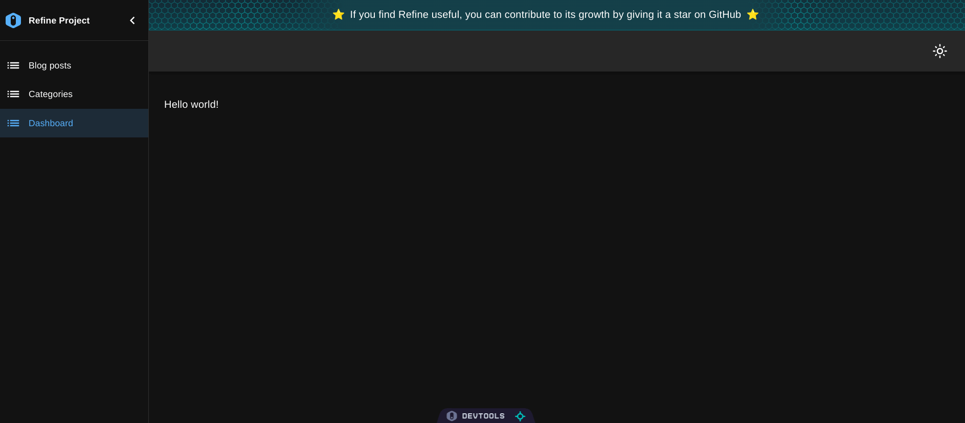
You will now see a dashboard entry in the sidebar. The dashboard will look like the image below. We will create charts and render them in the dashboard in the next sub-sections.
Before we start creating charts, let's create a simple interface for the data from our API. Create the src/interfaces/index.d.ts file. Copy and paste the interface below into it.
export interface IQueryResult {
  date: string;
  value: number;
}
How to install Recharts
You can install Recharts either from the npm package registry or get its UMD build via a CDN. Depending on your package manager, use one of the commands below to install Recharts.
npm install recharts
Create a Line chart using Recharts
Line charts consist of a series of data points connected using line segments. They are mostly used to represent time series data. You can use Rechart's built-in <LineChart /> component to create a Line chart like so:
<LineChart
  width={730}
  height={250}
  data={data}
  margin={{ top: 5, right: 30, left: 20, bottom: 5 }}
>
  <CartesianGrid strokeDasharray="3 3" />
  <XAxis dataKey="name" />
  <YAxis />
  <Tooltip />
  <Legend />
  <Line type="monotone" dataKey="value" stroke="#8884d8" />
</LineChart>
Charts in general need to have features such as axes, Cartesian grid, legend, and tooltips. Therefore, we need to use the <LineChart /> component with Rechart's built-in general and Cartesian components as in the example above.
The <LineChart /> component has the data prop for passing the data you want to represent on the Line chart. The data should be an array of objects like in the example below.
[
  { name: "a", value: 16 },
  { name: "b", value: 12 },
  { name: "c", value: 18 },
];
Let's create a simple Line chart in our Refine project. We will render it in the dashboard we created above. Start by creating the src/pages/dashboard/charts/line-chart.tsx file. Copy and paste the code below into it. The charts directory doesn't exist yet. Start by creating it.
import React from "react";
import {
  LineChart,
  Line,
  XAxis,
  YAxis,
  Tooltip,
  ResponsiveContainer,
} from "recharts";

import { IQueryResult } from "../../../interfaces";

export const LineChartComponent: React.FC<{
  dailyOrders: IQueryResult[];
}> = ({ dailyOrders }) => {
  return (
    <ResponsiveContainer width="100%" height="100%" aspect={500 / 300}>
      <LineChart
        width={500}
        height={300}
        data={dailyOrders}
        margin={{
          top: 5,
          right: 30,
          left: 20,
          bottom: 5,
        }}
      >
        <XAxis dataKey="date" />
        <YAxis />
        <Tooltip />
        <Line type="monotone" dataKey="value" stroke="#82ca9d" />
      </LineChart>
    </ResponsiveContainer>
  );
};
In the example above, the <LineChart /> component is wrapped in a responsive container. We will do the same while creating other charts later. We need to export the component we created above so that we can easily import and render it anywhere in our project. Create the src/pages/dashboard/charts/index.ts file. Copy and paste the code below into it.
export { LineChartComponent } from "./line-chart";
Let's now import the above component and render it in the <DashboardPage /> component. Copy and paste the code below into the src/pages/dashboard/list.tsx file.
Show DashboardPage code
import React from "react";
import { Grid } from "@mui/material";
import { useApiUrl, useCustom } from "@refinedev/core";

import dayjs from "dayjs";

const query = {
  start: dayjs().subtract(7, "days").startOf("day"),
  end: dayjs().startOf("day"),
};

import { LineChartComponent } from "./charts";

import { IQueryResult } from "../../interfaces";

export const formatDate = new Intl.DateTimeFormat("en-US", {
  month: "short",
  year: "numeric",
  day: "numeric",
});

const transformData = (data: IQueryResult[]): IQueryResult[] => {
  return data.map(({ date, value }) => ({
    date: formatDate.format(new Date(date)),
    value,
  }));
};

export const DashboardPage: React.FC = () => {
  const API_URL = useApiUrl("metrics");

  const { data: dailyRevenue } = useCustom({
    url: `${API_URL}/dailyRevenue`,
    method: "get",
    config: {
      query,
    },
    queryOptions: {
      select: ({ data }) => {
        return { data: transformData(data.data) };
      },
    },
  });

  const { data: dailyOrders } = useCustom({
    url: `${API_URL}/dailyOrders`,
    method: "get",
    config: {
      query,
    },
    queryOptions: {
      select: ({ data }) => {
        return { data: transformData(data.data) };
      },
    },
  });

  const { data: newCustomers } = useCustom({
    url: `${API_URL}/newCustomers`,
    method: "get",
    config: {
      query,
    },
    queryOptions: {
      select: ({ data }) => {
        return { data: transformData(data.data) };
      },
    },
  });

  return (
    <Grid
      container
      justifyContent="baseline"
      alignItems={"stretch"}
      spacing={2}
    >
      <Grid item xs={12} sm={6}>
        <LineChartComponent dailyOrders={dailyOrders?.data ?? []} />
      </Grid>
    </Grid>
  );
};
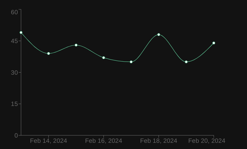
In the code above, we are using the useCustom hook to make custom query requests to the backend. The useCustom hook uses TanStack Query's useQuery hook under the hook. We have been querying the daily revenue, daily orders, and new customers of a restaurant business for the last seven days. We will represent the data in different types of charts. The dashboard should now have a Line chart that looks like the image below.
There are several Line chart variants you can create using Rechart's built-in components. For more complex charts, check out the Recharts documentation.
Create Area chart using Recharts
Recharts has the built-in <AreaChart /> component for creating area charts. You can compose the built-in <AreaChart /> component to create complex area charts in your React project.
You can use the <AreaChart /> component's data prop to pass the data you want to represent on an area chart. Like in the previous example, your data should be an array of objects.
[
  { name: "Name A", data: 4000 },
  { name: "Name B", data: 3000 },
];
To represent the above data in an area chart, you can use the <AreaChart /> component as in the example below. As before, the component names are self-explanatory.
<AreaChart
  width={500}
  height={300}
  data={data}
  margin={{
    top: 10,
    right: 30,
    left: 0,
    bottom: 0,
  }}
>
  <XAxis dataKey="name" />
  <YAxis />
  <Tooltip />
  <Area type="monotone" dataKey="data" stroke="#8884d8" fill="#8884d8" />
</AreaChart>
Let's now add an area chart to the Refine project we created above. Create the src/pages/dashboard/charts/area-chart.tsx file. Copy and paste the code below into it.
import {
  AreaChart,
  Area,
  XAxis,
  YAxis,
  Tooltip,
  ResponsiveContainer,
} from "recharts";

import { IQueryResult } from "../../../interfaces";

export const AreaChartComponent: React.FC<{ dailyRevenue: IQueryResult[] }> = ({
  dailyRevenue,
}) => {
  return (
    <ResponsiveContainer width="100%" height="100%" aspect={500 / 300}>
      <AreaChart
        width={500}
        height={300}
        data={dailyRevenue}
        margin={{
          top: 10,
          right: 30,
          left: 0,
          bottom: 0,
        }}
      >
        <XAxis dataKey="date" />
        <YAxis />
        <Tooltip />
        <Area type="monotone" dataKey="value" stroke="#8884d8" fill="#8884d8" />
      </AreaChart>
    </ResponsiveContainer>
  );
};
In the example above, we are representing the daily revenue of a restaurant business in an area chart. We are fetching the data in our dashboard component and passing it as a prop to the above component. Once again we are wrapping the area chart in a responsive container.
You need to export the above component by adding the changes below to the src/pages/dashboard/charts/index.ts file.
Show Charts code
export { LineChartComponent } from "./line-chart";
export { AreaChartComponent } from "./area-chart";
We can now import and render the above component in the <DashboardPage /> component. Add the changes below to the src/pages/dashboard/list.tsx file.
...

import {
  LineChartComponent,
  AreaChartComponent,
} from "./charts";

 ...

export const DashboardPage: React.FC = () => {

 ...

  return (
    <Grid
      container
      justifyContent="baseline"
      alignItems={"stretch"}
      spacing={2}
    >
      <Grid item xs={12} sm={6}>
        <LineChartComponent dailyOrders={dailyOrders?.data ?? []} />
      </Grid>
      <Grid item xs={12} sm={6}>
        <AreaChartComponent dailyRevenue={dailyRevenue?.data ?? []} />
      </Grid>
    </Grid>
  );
};
Your dashboard should now have a simple area chart that looks like the image below.
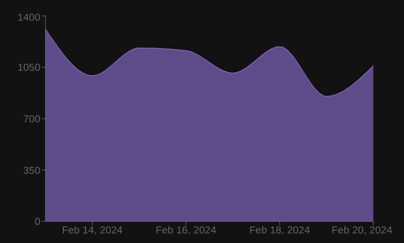
There are several types of Area charts. What we have created above is a simple Area chart. Recharts has built-in functionality for implementing most of them. For more, check out the documentation.
Create a Bar chart using Recharts
Bar charts are among the most common charts for visualizing data. You can use it to visually represent categorical data. Recharts has the built-in <BarChart /> component for creating bar charts.
Like the other types of charts, the data you want to represent on a bar chart should be an array of objects. You need to pass it to the <BarChart /> component as the value of the data prop.
Let's add a bar chart to the dashboard in the Refine project we created above. Create the src/pages/dashboard/charts/bar-chart.tsx file. Copy and paste the code below into it.
import React from "react";

import {
  BarChart,
  Bar,
  Rectangle,
  XAxis,
  YAxis,
  Tooltip,
  ResponsiveContainer,
} from "recharts";

import { IQueryResult } from "../../../interfaces";

export const BarChartComponent: React.FC<{ newCustomers: IQueryResult[] }> = ({
  newCustomers,
}) => {
  return (
    <ResponsiveContainer width="100%" height="100%" aspect={500 / 300}>
      <BarChart
        width={500}
        height={300}
        data={newCustomers}
        margin={{
          top: 5,
          right: 30,
          left: 20,
          bottom: 5,
        }}
      >
        <XAxis dataKey="date" />
        <YAxis />
        <Tooltip />
        <Bar
          dataKey="value"
          fill="#8884d8"
          activeBar={<Rectangle fill="pink" stroke="blue" />}
        />
      </BarChart>
    </ResponsiveContainer>
  );
};
We need to export the component above. Add the changes below to the src/pages/dashboard/charts/index.ts file.
export { LineChartComponent } from "./line-chart";
export { AreaChartComponent } from "./area-chart";
export { BarChartComponent } from "./bar-chart";
We can now import and render the above component. Add the changes below to the src/pages/dashboard/list.tsx file.
Show List code
...

import {
  LineChartComponent,
  AreaChartComponent,
  BarChartComponent,
} from "./charts";

...

export const DashboardPage: React.FC = () => {
 ...

  return (
    <Grid
      container
      justifyContent="baseline"
      alignItems={"stretch"}
      spacing={2}
    >
      <Grid item xs={12} sm={6}>
        <LineChartComponent dailyOrders={dailyOrders?.data ?? []} />
      </Grid>
      <Grid item xs={12} sm={6}>
        <AreaChartComponent dailyRevenue={dailyRevenue?.data ?? []} />
      </Grid>
      <Grid item xs={12} sm={6}>
        <BarChartComponent newCustomers={newCustomers?.data ?? []} />
      </Grid>
    </Grid>
  );
};
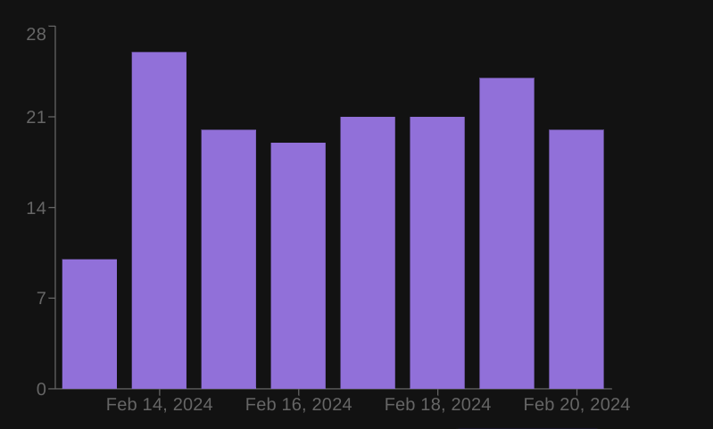
After rendering the above component, your dashboard should now have a bar chart that looks like the image below.
Create Scatter chart using Recharts
Scatter charts are useful to graphically represent the relationship between two variables. Like the other charts mentioned above, Recharts has the built-in <ScatterChart /> component for creating scatter charts.
Let's create a simple scatter chart in this article. Create the src/pages/dashboard/charts/scatter-chart.tsx file. Copy and paste the code below into it.
import React from "react";
import {
  ScatterChart,
  Scatter,
  XAxis,
  YAxis,
  Tooltip,
  ResponsiveContainer,
} from "recharts";

import { IQueryResult } from "../../../interfaces";

const formatData = (
  dailyOrders: IQueryResult[],
  newCustomers: IQueryResult[],
) => {
  const formattedData = [];

  for (let i = 0; i < dailyOrders.length; i++) {
    if (!dailyOrders[i] || !newCustomers[i]) continue;

    if (dailyOrders[i].date === newCustomers[i].date) {
      formattedData.push({
        date: dailyOrders[i].date,
        dailyOrders: dailyOrders[i].value,
        newCustomers: newCustomers[i].value,
      });
    }
  }

  return formattedData;
};

export const ScatterChartComponent: React.FC<{
  dailyOrders: IQueryResult[];
  newCustomers: IQueryResult[];
}> = ({ dailyOrders, newCustomers }) => {
  const formattedData = formatData(dailyOrders, newCustomers);

  return (
    <ResponsiveContainer width="100%" height="100%" aspect={500 / 300}>
      <ScatterChart
        width={500}
        height={300}
        margin={{
          top: 20,
          right: 20,
          bottom: 20,
          left: 20,
        }}
      >
        <XAxis type="number" dataKey="dailyOrders" name="Orders" />
        <YAxis type="number" dataKey="newCustomers" name="Customers" />
        <Tooltip cursor={{ strokeDasharray: "3 3" }} />
        <Scatter name="A school" data={formattedData} fill="#8884d8" />
      </ScatterChart>
    </ResponsiveContainer>
  );
};
In the example above, we wrapped the chart in a responsive container and passed the data to the Scatter component instead of the ScatterChart. Similar to the other charts we have already looked at, the data should be an array of objects.
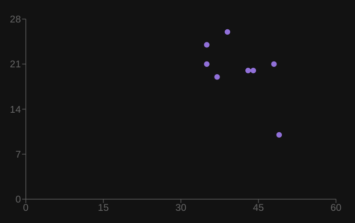
In the example above, we had to transform the data because we wanted to determine the relationship between two variables(daily orders and new customers).
Let's export the above component. Add the changes below to the src/pages/dashboard/charts/index.ts file.
export { LineChartComponent } from "./line-chart";
export { AreaChartComponent } from "./area-chart";
export { BarChartComponent } from "./bar-chart";
export { ScatterChartComponent } from "./scatter-chart";
You can now import and render the above component in the dashboard. Add the changes below to the src/pages/dashboard/list.tsx file.
Show List code
...

import {
  LineChartComponent,
  AreaChartComponent,
  BarChartComponent,
  ScatterChartComponent,
} from "./charts";

i...

export const DashboardPage: React.FC = () => {
 ...

  return (
    <Grid
      container
      justifyContent="baseline"
      alignItems={"stretch"}
      spacing={2}
    >
      <Grid item xs={12} sm={6}>
        <LineChartComponent dailyOrders={dailyOrders?.data ?? []} />
      </Grid>
      <Grid item xs={12} sm={6}>
        <AreaChartComponent dailyRevenue={dailyRevenue?.data ?? []} />
      </Grid>
      <Grid item xs={12} sm={6}>
        <BarChartComponent newCustomers={newCustomers?.data ?? []} />
      </Grid>
      <Grid item xs={12} sm={6}>
        <ScatterChartComponent
          dailyOrders={dailyOrders?.data ?? []}
          newCustomers={newCustomers?.data ?? []}
        />
      </Grid>
    </Grid>
  );
};
After rendering the above component, the dashboard should now have a scatter chart that looks like the image below.
Create a Pie chart using Recharts
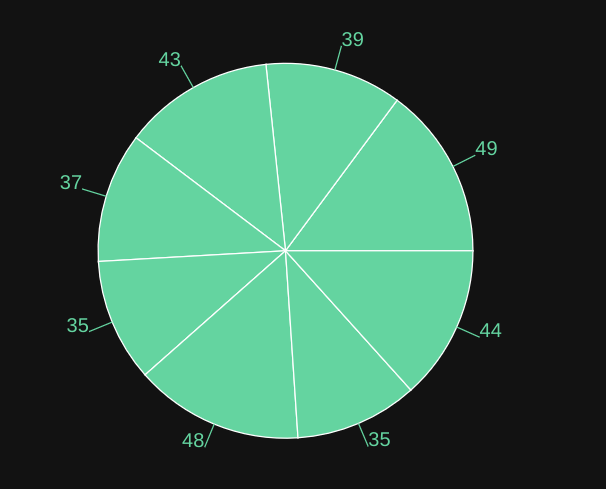
A pie chart is one of the most common and easy-to-understand charts. It is a circular graph that is split into multiple sectors. Each sector in a pie chart represents a particular category of data and its size is proportional to the quantity of the category it represents.
In this section, we will create a simple Pie chart using Recharts. Let's start by creating the src/pages/dashboard/charts/pie-chart.tsx file. Copy and paste the code below into it.
import React from "react";
import { PieChart, Pie, ResponsiveContainer } from "recharts";

import { IQueryResult } from "../../../interfaces";

export const PieChartComponent: React.FC<{ dailyOrders: IQueryResult[] }> = ({
  dailyOrders,
}) => {
  return (
    <ResponsiveContainer width="100%" height="100%" aspect={300 / 300}>
      <PieChart width={300} height={300}>
        <Pie
          data={dailyOrders}
          dataKey="value"
          nameKey="date"
          cx="50%"
          cy="40%"
          outerRadius={150}
          fill="#82ca9d"
          label
        />
      </PieChart>
    </ResponsiveContainer>
  );
};
Let's export the above component so that we can import it anywhere in our application. Add the changes below to the src/pages/dashboard/charts/index.ts file.
export { LineChartComponent } from "./line-chart";
export { AreaChartComponent } from "./area-chart";
export { BarChartComponent } from "./bar-chart";
export { ScatterChartComponent } from "./scatter-chart";
export { PieChartComponent } from "./pie-chart";
Let's import and render the above component in our dashboard. Add the changes below to the src/pages/dashboard/list.tsx file.
Show List code
...

import {
  LineChartComponent,
  AreaChartComponent,
  BarChartComponent,
  ScatterChartComponent,
  PieChartComponent,
} from "./charts";

...

  return (
    <Grid
      container
      justifyContent="baseline"
      alignItems={"stretch"}
      spacing={2}
    >
      <Grid item xs={12} sm={6}>
        <LineChartComponent dailyOrders={dailyOrders?.data ?? []} />
      </Grid>
      <Grid item xs={12} sm={6}>
        <AreaChartComponent dailyRevenue={dailyRevenue?.data ?? []} />
      </Grid>
      <Grid item xs={12} sm={6}>
        <BarChartComponent newCustomers={newCustomers?.data ?? []} />
      </Grid>
      <Grid item xs={12} sm={6}>
        <ScatterChartComponent
          dailyOrders={dailyOrders?.data ?? []}
          newCustomers={newCustomers?.data ?? []}
        />
      </Grid>
      <Grid item xs={12} sm={6}>
        <PieChartComponent dailyOrders={dailyOrders?.data ?? []} />
      </Grid>
    </Grid>
  );
};
Your dashboard should now have a Pie chart that looks like the image below.
Create TreeMap using Recharts
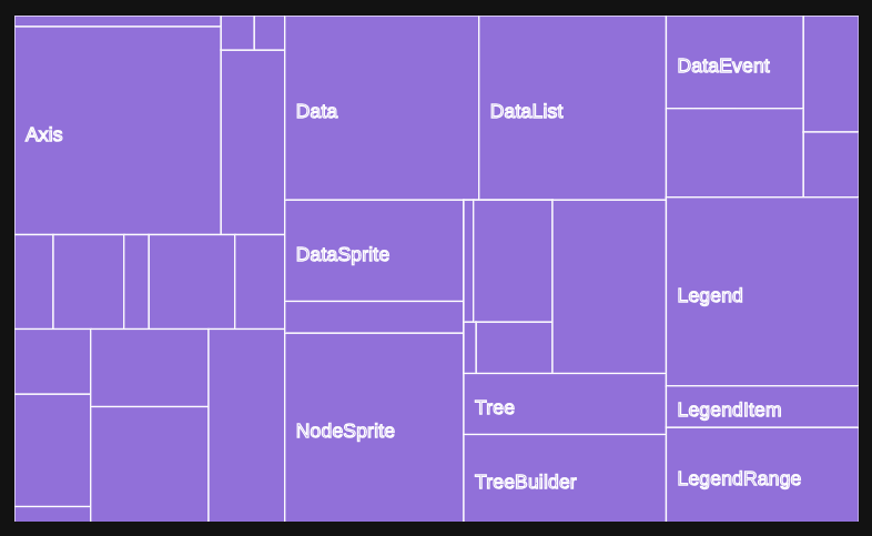
A Treemap is a data visualization tool similar to a Pie chart. However, instead of using a circular graph and sectors to represent data, a Treemap instead uses rectangles and nested rectangles.
With a Treemap, a rectangle represents a category, and nested rectangles represent sub-categories within a category. Recharts has the built-in <Treemap /> component for creating Treemaps. You can pass the data as the value of the data attribute.
Let's add a simple Treemap to our dashboard. Create the src/pages/dashboard/charts/treemap.tsx file. Copy and paste the code below into it.
Show Treemap code
import React from "react";
import { Treemap, ResponsiveContainer } from "recharts";

const data = [
  {
    name: "axis",
    children: [
      { name: "Axes", size: 1302 },
      { name: "Axis", size: 24593 },
      { name: "AxisGridLine", size: 652 },
      { name: "AxisLabel", size: 636 },
      { name: "CartesianAxes", size: 6703 },
    ],
  },
  {
    name: "controls",
    children: [
      { name: "AnchorControl", size: 2138 },
      { name: "ClickControl", size: 3824 },
      { name: "Control", size: 1353 },
      { name: "ControlList", size: 4665 },
      { name: "DragControl", size: 2649 },
      { name: "ExpandControl", size: 2832 },
      { name: "HoverControl", size: 4896 },
      { name: "IControl", size: 763 },
      { name: "PanZoomControl", size: 5222 },
      { name: "SelectionControl", size: 7862 },
      { name: "TooltipControl", size: 8435 },
    ],
  },
  {
    name: "data",
    children: [
      { name: "Data", size: 20544 },
      { name: "DataList", size: 19788 },
      { name: "DataSprite", size: 10349 },
      { name: "EdgeSprite", size: 3301 },
      { name: "NodeSprite", size: 19382 },
      {
        name: "render",
        children: [
          { name: "ArrowType", size: 698 },
          { name: "EdgeRenderer", size: 5569 },
          { name: "IRenderer", size: 353 },
          { name: "ShapeRenderer", size: 2247 },
        ],
      },
      { name: "ScaleBinding", size: 11275 },
      { name: "Tree", size: 7147 },
      { name: "TreeBuilder", size: 9930 },
    ],
  },
  {
    name: "events",
    children: [
      { name: "DataEvent", size: 7313 },
      { name: "SelectionEvent", size: 6880 },
      { name: "TooltipEvent", size: 3701 },
      { name: "VisualizationEvent", size: 2117 },
    ],
  },
  {
    name: "legend",
    children: [
      { name: "Legend", size: 20859 },
      { name: "LegendItem", size: 4614 },
      { name: "LegendRange", size: 10530 },
    ],
  },
];

export const TreemapComponent: React.FC = () => {
  return (
    <ResponsiveContainer width="100%" height="100%" aspect={500 / 300}>
      <Treemap
        width={500}
        height={300}
        data={data}
        dataKey="size"
        aspectRatio={500 / 300}
        stroke="#fff"
        fill="#8884d8"
      />
    </ResponsiveContainer>
  );
};
In the example above, we have hard-coded the data because the API doesn't have a dataset we can use to create a Treemap. In a typical real-world project, you will retrieve the data from an API. You can export the above component from the src/pages/dashboard/charts/index.ts file like so:
Show Charts code
export { LineChartComponent } from "./line-chart";
export { AreaChartComponent } from "./area-chart";
export { BarChartComponent } from "./bar-chart";
export { ScatterChartComponent } from "./scatter-chart";
export { PieChartComponent } from "./pie-chart";
export { TreemapComponent } from "./treemap";
You can now import the above component and render it in the dashboard.
import React from "react";
import { Grid } from "@mui/material";
import { useApiUrl, useCustom } from "@refinedev/core";

import dayjs from "dayjs";

const query = {
  start: dayjs().subtract(7, "days").startOf("day"),
  end: dayjs().startOf("day"),
};

import {
  LineChartComponent,
  AreaChartComponent,
  BarChartComponent,
  ScatterChartComponent,
  PieChartComponent,
  TreemapComponent,
} from "./charts";

import { IQueryResult } from "../../interfaces";

export const formatDate = new Intl.DateTimeFormat("en-US", {
  month: "short",
  year: "numeric",
  day: "numeric",
});

const transformData = (data: IQueryResult[]): IQueryResult[] => {
  return data.map(({ date, value }) => ({
    date: formatDate.format(new Date(date)),
    value,
  }));
};

export const DashboardPage: React.FC = () => {
  const API_URL = useApiUrl("metrics");

  const { data: dailyRevenue } = useCustom({
    url: `${API_URL}/dailyRevenue`,
    method: "get",
    config: {
      query,
    },
    queryOptions: {
      select: ({ data }) => {
        return { data: transformData(data.data) };
      },
    },
  });

  const { data: dailyOrders } = useCustom({
    url: `${API_URL}/dailyOrders`,
    method: "get",
    config: {
      query,
    },
    queryOptions: {
      select: ({ data }) => {
        return { data: transformData(data.data) };
      },
    },
  });

  const { data: newCustomers } = useCustom({
    url: `${API_URL}/newCustomers`,
    method: "get",
    config: {
      query,
    },
    queryOptions: {
      select: ({ data }) => {
        return { data: transformData(data.data) };
      },
    },
  });

  return (
    <Grid
      container
      justifyContent="baseline"
      alignItems={"stretch"}
      spacing={2}
    >
      <Grid item xs={12} sm={6}>
        <LineChartComponent dailyOrders={dailyOrders?.data ?? []} />
      </Grid>
      <Grid item xs={12} sm={6}>
        <AreaChartComponent dailyRevenue={dailyRevenue?.data ?? []} />
      </Grid>
      <Grid item xs={12} sm={6}>
        <BarChartComponent newCustomers={newCustomers?.data ?? []} />
      </Grid>
      <Grid item xs={12} sm={6}>
        <ScatterChartComponent
          dailyOrders={dailyOrders?.data ?? []}
          newCustomers={newCustomers?.data ?? []}
        />
      </Grid>
      <Grid item xs={12} sm={6}>
        <PieChartComponent dailyOrders={dailyOrders?.data ?? []} />
      </Grid>
      <Grid item xs={12} sm={6}>
        <TreemapComponent />
      </Grid>
    </Grid>
  );
};
Your dashboard should now have a Treemap that looks like the image below.
Recharts Performance Optimization with Large Data Sets
I have been researching the best practices to keep Recharts performing well, especially with larger datasets, and wanted to pass on a few tips that might help keep things smooth. Recharts is good for data visualization, but small adjustments can make all the difference when working with sizable chunks of data. Here's what I came up with:
Limit Data Points to Display Only What's Necessary
The performance can really slow down when dealing with a time series or high-frequency data, especially if it tries to render each and every data point. The solution is straightforward: limit the number of data points or summarize data. For example, you might display every 10th data point or use averages for simpler overviews.
Prevent Re-Rendering with React.memo or PureComponent
If your chart data or settings aren’t changing on every render, use React.memo or PureComponent to prevent unnecessary updates. This is especially useful with big data sets or complex charts.
Example with React.memo:
import React, { memo } from "react";
import { LineChart, Line } from "recharts";

const LineChartComponent = memo(({ data }) => (
  <LineChart width={600} height={300} data={data}>
    <Line type="monotone" dataKey="value" stroke="#8884d8" />
  </LineChart>
));
Using memo ensures that LineChartComponent only re-renders if the data prop changes.
Minimize SVG Complexity by Limiting Chart Elements
Recharts renders using SVG, so reducing the number of elements in the SVG will help performance. For example, remove grid lines, extra labels, or multiple tooltips if they’re not necessary.
Keeping Only Essential Chart Elements:
<LineChart width={600} height={300} data={data}>
  <Line type="monotone" dataKey="value" stroke="#8884d8" />
  <XAxis dataKey="date" hide={true} /> {/* Hiding axis labels */}
  <YAxis hide={true} />
  <Tooltip /> {/* Optional: Only keep if needed */}
</LineChart>
This keeps the chart minimal and improves performance.
Lazy-Load Charts Using Intersection Observers
If you have multiple charts on a page, consider lazy-loading them as the user scrolls. This improves initial load times by rendering charts only when visible. You can use react-intersection-observer for easy implementation.
import { useInView } from "react-intersection-observer";

const ChartComponent = ({ data }) => {
  const { ref, inView } = useInView({ triggerOnce: true });

  return (
    <div ref={ref}>
      {inView && (
        <LineChart width={600} height={300} data={data}>
          <Line type="monotone" dataKey="value" stroke="#8884d8" />
        </LineChart>
      )}
    </div>
  );
};
Setting triggerOnce: true loads the chart only when it first comes into view, conserving resources if the user doesn’t scroll down.
How to Make Recharts Responsive for Different Screen Sizes
I’ve put together some tips on making Recharts charts responsive to different screen sizes. Recharts itself has some built-in features for responsiveness, but a few tweaks can make sure the charts look great on both desktop and mobile.
Automatic Resizing Using ResponsiveContainer
Recharts provides a ResponsiveContainer component that allows the chart to automatically resize to fit its container. Wrapping charts in this component is a quick way to make them responsive:
import { LineChart, Line, ResponsiveContainer } from "recharts";

const ResponsiveLineChart = ({ data }) => (
  <ResponsiveContainer width="100%" height={300}>
    <LineChart data={data}>
      <Line type="monotone" dataKey="value" stroke="#8884d8" />
    </LineChart>
  </ResponsiveContainer>
);
Here, width="100%" makes the chart resize to fit the container width, while height={300} keeps the height fixed.
Set Aspect Ratio for Consistent Proportions
For charts that need to maintain consistent proportions (like in grids), you can set an aspect ratio in ResponsiveContainer. This keeps the chart’s proportions uniform across different screens:
<ResponsiveContainer width="100%" aspect={4 / 3}>
  <LineChart data={data}>
    <Line type="monotone" dataKey="value" stroke="#8884d8" />
  </LineChart>
</ResponsiveContainer>
Setting aspect={4 / 3} means the height will adjust according to the width, preserving a 4:3 ratio and preventing stretching on wide or narrow screens.
Make Chart Elements Adaptive to Screen Size
Some elements like tooltips, labels, or legends may need to be hidden or resized on smaller screens. You can use CSS media queries to style these elements conditionally or use JavaScript to control visibility based on screen width:
import { useMediaQuery } from "react-responsive";

const ResponsiveLineChart = ({ data }) => {
  const isMobile = useMediaQuery({ query: "(max-width: 768px)" });

  return (
    <ResponsiveContainer width="100%" height={isMobile ? 200 : 300}>
      <LineChart data={data}>
        <Line type="monotone" dataKey="value" stroke="#8884d8" />
        {!isMobile && <Legend />} {/* Only show legend on larger screens */}
      </LineChart>
    </ResponsiveContainer>
  );
};
In this example, we use useMediaQuery to adjust the chart’s height and hide the legend on smaller screens.
Proper Padding and Margins
Using Recharts on smaller screens may require padding and margin adjustments to prevent elements from overlapping. Setting smaller margins on mobile can help avoid crowding:
<LineChart
  data={data}
  margin={{
    top: 5,
    right: isMobile ? 10 : 30,
    left: isMobile ? 10 : 30,
    bottom: 5,
  }}
>
  <Line type="monotone" dataKey="value" stroke="#8884d8" />
</LineChart>
These recommendations should make it easier to design charts that adapt well to any screen size, ensuring a better user experience across devices.
Conclusion
Sometimes you may have to integrate data visualization in your React project. Charts make it easy to present data in an easy-to-understand and visually appealing way.
There are several frameworks for creating charts in React. Recharts is one of the most popular and feature-rich packages for creating charts in a React project or React-based frameworks such as refine.
Recharts support several types of charts out of the box. In this article, we have only explored a subset of charts you can create using Recharts. Check the documentation for details.

